| |
"Who I Am" business card
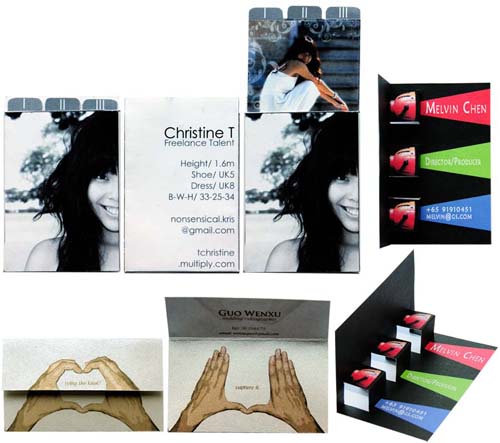
In turning "Who Am I" into "Who I AM", [clockwise from top left] Christine Tan, a part-time model incorporates her profile on the back of the card and an image of herself on the front. Her card is designed to contain three cards with different images of herself on each card.
Melvin Chen aspires to become a movie director so the solution to his card calls for a design that turns a flat card into a dimensional one.
Guo Wen Xu freelances by photographing weddings. Using a lot of hand signals during his photographic sessions to signal to his clients, he creates a card that reveals two hand gestures which symbolize love and capturing the love eternally by tying the knot with his service.
Click here to 80 creative and unique business cards.
(Aug - Nov 2008)

Creative Outfit
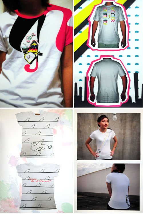
Creative T-shirts as a platform to communicate visually, (clockwise) Michelle Heng, Janell Hoong, Lee Shu Xian and Janice Tan expressed what they think creativity is all about. In order to extract the essence of creativity, they define in their own words what creativity is about in 100 words. Then, they explore a ttoal of at least 50 different ideas on a set of T-shirt templates provided. To counter the polysemous nature of images, text is minimally used to describe the visually-driven design. Visual literacy is addressed in which the applications of elements and principles of design, as well as the clarity and effectiveness of the message, planning and execution, inventiveness and originally were also emphasized.
(Aug - Nov 2008)
Directions poster
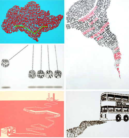
In this experimental project to render text as visual, (from clockwise) Lian Yiting, Celine Tham, Cheryl Chan, Justin Zhuang, and Ahmad Iskandar first wrote the actual directions they take from home to school. Once the story is refined and refined, they visually translate their stories into a directions poster. They must focus on visualizing their experience by applying elements and principles of design, specifically on how lines of text can be structured to rhythmically form shapes, patterns, contrast, movement, depth, repetition and symmetry for harmony or asymmetry for variety. Other elements such as colors which can influence the tone of the story, texture that adds character to the look and feel, orientations that can facilitate the structure of their store were also explored. The project aims to promote visual literacy as the project expands the students' abilities to think and communicate visually.
(Aug - Nov 2008)
Directions poster
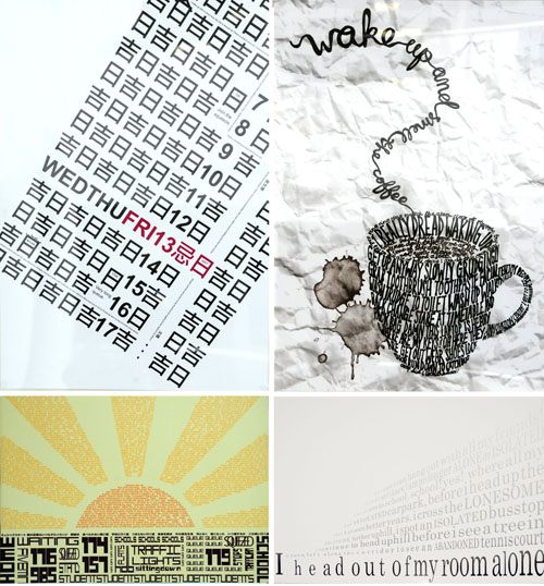
Every student shared their going to school experiences and the combination of words and images resulted in an engaging and yet informative posters as told by (Clockwise) Kyle Leung who referred to calendars as his alarm clock; Stephanie Phua who relied on caffeine; Melvin Chen who needed a healthy dosage of sunshine and Sim Li Fen who took things one step at a time.
(Aug - Nov 2008)
|
|
YEOH AS EDUCATOR
- MY STUDENTS' CREATIONS
- MY WRITINGS
Select below to view my students' awards as well as their creations from Nanyang Technological University, Texas Tech University, and Southern Arkansas University.
|