| |
Syllabus for a Typography course (S351) taught at Indiana University Southeast, New Albany, Indiana, USA for the fall semester from Aug - Dec 2016.
Download: S351 Typography syllabus fall 2016.pdf

1st exercise: The Basics
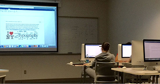
Our first exercise requires the students to read an assigned reading material to introduce them to what type is; specifically the characteristics of type such as family, style, case, weight, size, position, color and treatment. In subsequent exercises, they will discover that by altering the font size, font features (medium, italic, bold), position, spacing and so forth, we can affect the effectiveness of a message. This is only one of the many knowledge they will discover and they are tested by taking pop quiz to test your understanding of typography.
Grading criteria (5 points):
- The ability to translate concepts covered in class (1 pt)
- Elaboration on why typography is important (1 pt)
- Exhibit an understanding of tracking, kerning, spacing, & alignment (1 pt)
- Exhibit an understanding of the anatomy of a typeface (1 pt)
- Sketches that reflect the era or look and feel of a typeface (1 pt)
2nd exercise: Mixing Typefaces
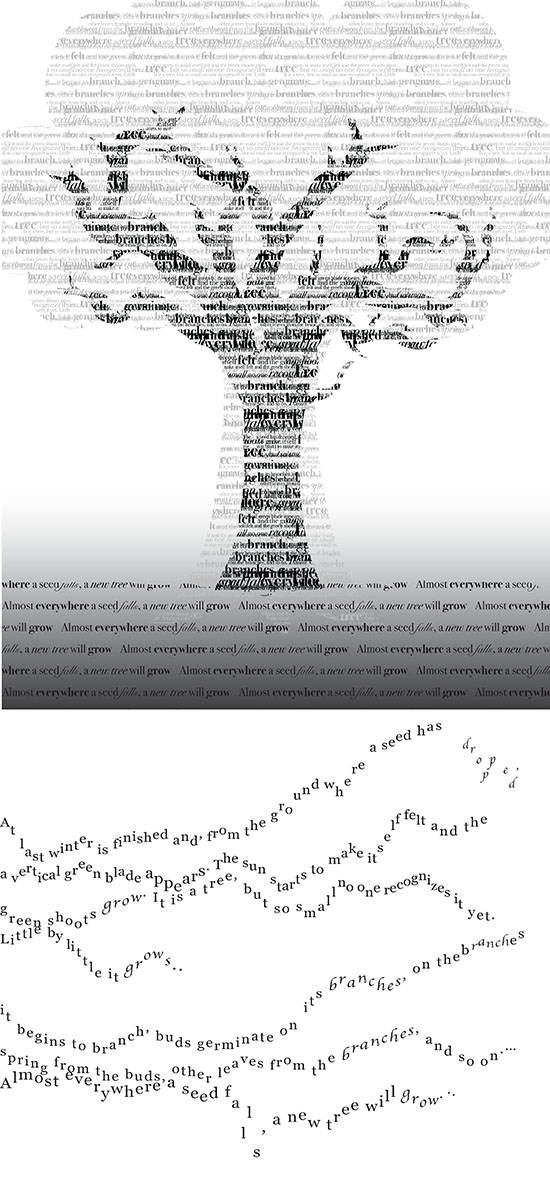
The second exercise is about the application of your knowledge of the physical makeup of type, specifically its characteristics such as family, style, case, weight, size, position, color and treatment. Working with Bruno Munari's "Drawing a tree" with the following text from page 4, "At last winter is finished and, from the ground where a seed has dropped, a vertical green blade appears. The sun starts to make itself felt and the green shoots grow. It is a tree, but so small no one recognizes it yet. Little by little it grows... it begins to branch, buds germinate on its branches, other branches spring from the buds, other leaves from the branches, and so on. ... Almost everywhere a seed falls, a new tree will grow," the students explore: mixing and matching of typefaces as well as scaling of type, line spacing, kerning, tracking and alignment within a grid structure.
Grading criteria (20 points):
- Experimented and exhibited mixing and matching of typefaces (5 pts)
- Exhibit abilities to type scaling to achieve a desired effect - reverse. Include mixing and matching (5 pts)
- Exhibit abilities to type scaling to achieve a desired effect - experimental. Include mixing and matching (5 pts)
- Line spacing, kerning, tracking and aligning (5 pts)
Deliverables:
- Two (or more) mixing and matching of typefaces;
- Two (or more) type scaling;
- Two (or more) line spacing;
- Two (or more) kerning;
- Two (or more) tracking;
- Two (or more) aligning in PDF or JPG formats measuring 8.5" x 11" in black and white.
Shown here are samples of works by Edward Downs and Sarah Nasr.
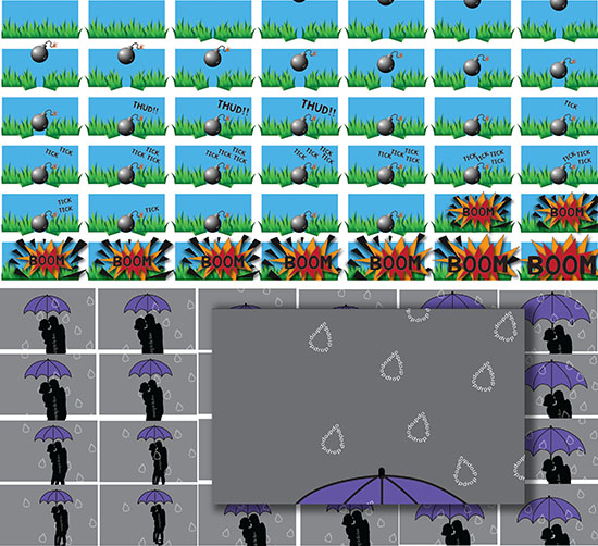
3rd exercise: Animated Type

This exercise introduces the concept of 'persistence of vision' and repetition to create the illusion of motion by creating a flip book sized at 2.5" x 4" (totaling at least 40 sheets). Print the pages on thicker card stock and assemble it into a bound book. Using onomatopoeia and other supportive visual elements, the students pick a word to suggest rhythm and movement as visual rhythms are created by repeating art elements to create patterns.They have to consider contrast to create excitement and interest.
Onomatopoeia is the naming of a thing or action by a vocal imitation of the sound associated with it. Some common examples include: beep, boing, boom, clap, crackle, hiccup, ping pong, plop, poof, thud, tick-tock, swoosh, zap. Their flip book must predominantly be type-driven with possible inclusions of blocks of color, lines, and abstract shapes for content on pages which could also be repeated on the cover and spine. It may not include photographic images.
Grading criteria (15 points):
- Appropriateness of the chosen onomatopoeic word to suggest movement (3 pts)
- Level of rhythmic movement visible when the book is flipped (3 pts)
- Effective usage of space to suggest movement (3 pts)
- Scalability of the font to suggest contrast (3 pts)
- Quality of the final flip book (3 pts)
Deliverables:
- A (one-sided) colored, bound flip book measuring 2.5" x 4" showing the front cover and spine.
Shown here is an assignment created by Joseph Dicken.
3rd exercise: Animated Type
More student works from Sydney Powell (top) and Kayla Feuqay (bottom).
4th exercise: Alternative Typography
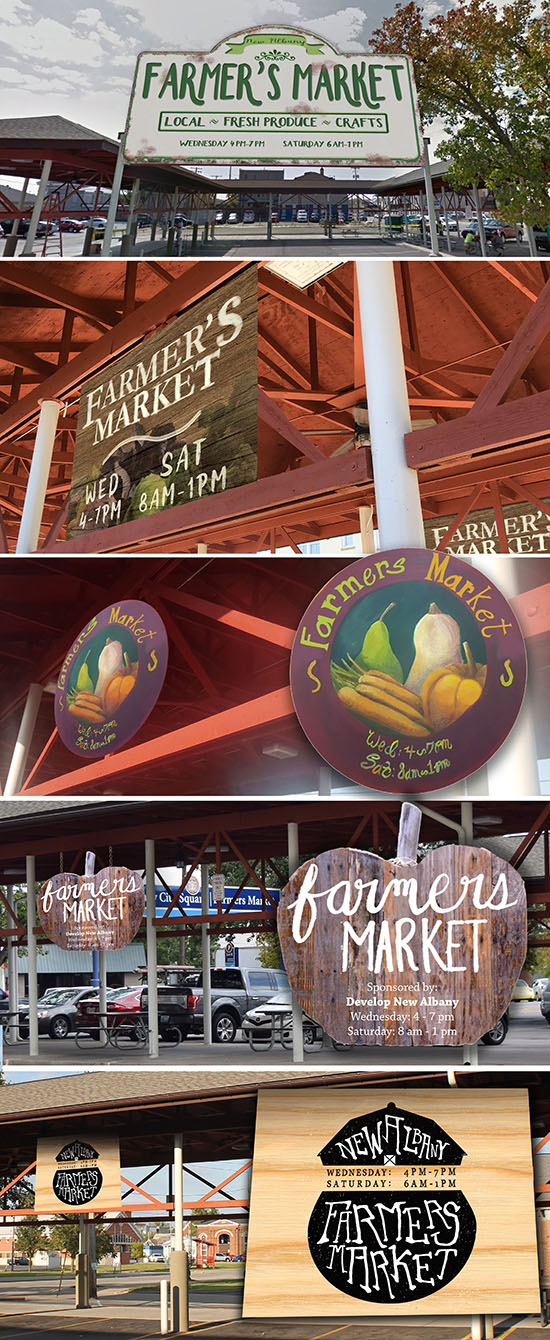
The root words that make up 'typography' are typo (type) and graphy (drawing), literally meaning drawing with type. Borrowing characteristics of display type, students create their own typeface for New Albany's "Farmers Market" to capture the 'essence' of the market. While you will eventually use the computer to assemble the pieces together, it suffices to think of the exercise requiring them to create by experimenting with hand lettering. Therefore, refrain from using readily available fonts from the computer for "Farmer's Market" but they may do so for the operation hours and sponsor information.
Grading criteria (15 points):
- Appropriateness of the chosen type to reflect the 'essence' of Farmers Market (3 pts)
- Custom-crafted/lettered by hand (3 pts)
- Pictures with good angles with one showing as little tilting as possible, nicely cropped to remove unnecessary background distractions, shot on a bright day and not blurry (3 pts)
- Readability of the font created (3 pts)
- Overall presentation (3 pts)
Deliverables:
- The final result (JPG or PDF) must consist of a superimposed image of your signage design on the actual signage space where the market is located.
- A total of three images showing the signage from the front, side and far away.
- Three 8.5" x 11" sized prints showing three angles.
Shown here are works from Joseph Dicken, Emma Romig, Sarah Nasr, Sydney Feuqay, Sydney Powell, and Parker Bolin.
5th exercise: Design Your Own Font
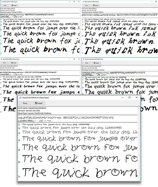
Typeface design is a fundamental element in communication, with profound implications for learning, work, and entertainment. The objective of this exercise is to identify 26 letters of the alphabet (both in majuscule and miniscule forms) as a typographic expression in which students create their own typeface via myscriptfont.com to reflect your personality. There are professionally available software such as FontLab Studio and Fontographer for font creations but this exercise is meant as an exploratory and introduction to font creations.
The font the students create is mainly a casual script or informal scripts that reflects their personality. As such the informal scripts that they create will be devoid of traditional anatomical requirements (such as serif, counter, spine, counter, finial, cross bar, or terminal) but they must not overlook the most important requirement for the effectiveness of a font: legibility. Although it may look like everyday handwriting, they are advised to take it to a next level. However, in order to complete the assignment, they used Adobe Illustrator/Photoshop to realize the project, mainly just as a tool.
Grading criteria (15 points):
- Appropriateness of the hand-lettered type in reflecting one's personality (3 pts)
- Exploration of fonts in at least three different variations (light, medium, extra bold) (6 pts)
- Considerations and evidence of legibility (3 pts)
- Complete set with 3 different variations based on the original font. 4 total (3 pts)
Deliverables:
- A print out of the font in upper and lower cases in three different variations.
References:
Download template here: http://www.myscriptfont.com/
About Fontographer: http://old.fontlab.com/font-editor/fontographer/
About Fontlab studio: http://old.fontlab.com/font-editor/fontlab-studio/
Shown here are works of (top left) Joseph Dicken, (top right) Parker Bolin, (bottom left) Edward Downs and (bottom right) Emily Verstynen.
Decking Your Identity
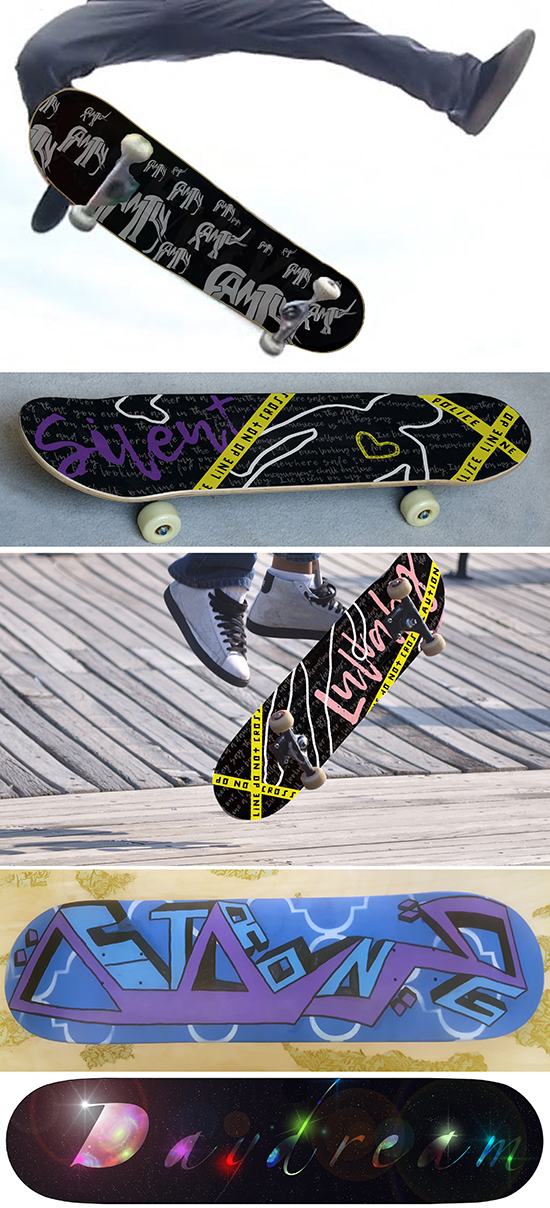
In today's world, people purchase objects with design that represent their personal identity albeit political, social, cultural, and other considerations may end up sipping into their choices. The job of a graphic designer is to understand the multitude of influences and to graphically represent these ideas visually on a message which can manifest into a product which we use.
In a consumptive marketplace where consumers' interests can be heightened, the final project is about using graphical arts to reflect the different identities on skateboards. The students are to treat the deck of a skateboard as a canvas for their personal expressions, beliefs, outlooks, lifestyle and so forth. Pick one direction to be used that to analyze the modern trends of graphic design. It suffices that they create their ideas digitally. However, they also have the option to earn extra credit (2 points towards your averaged final grade) if they apply your work on a real skateboard. They are expected to experiment with visualization techniques that are not limited to stenciling, direct painting, spray painting, painting, shellacking, etc and to apply the technique directly to an actual skateboard). If you choose to design it digitally, they are not entitled to the two points.
Objectives:
- To demonstrate the ability to use design thinking strategies in solving graphic design problems;
- To explore the relationships of graphic design to other disciplines such as pop culture, activism, and individualistic expressions through graphical arts;
- To learn the different techniques available to produce graphical arts
Deliverables:
- A designed deck of a skateboard showing a reflection of one's identity in actual size.
- A digitized file at 300 dpi in RGB, JPG or PDF formats showing the surface of the deck and two other photographic shots showing its application on a skateboard).
- Experimentation with different visualization techniques that are not limited to stenciling, direct painting, spray painting, painting, shellacking, etc.
Grading criteria (25%):
- Made as many sketches as possible (minimal 20) in search for ideas (5 pts)
- Experimented with a manual technique in exploring graphical arts (5 pts)
- Originality in the creation of one's own artwork/other necessary requirements for the fulfillment of the project (5 pts)
- Application of ideas on a digital mockup (5 pts)
- Quality of final artwork/presentation (5 pts)
- Extra bonus if you execute or apply your design or on a deck of a skateboard. (2 points towards final grade).
Shown here are works of (top down) Edward Downs, Kayla Feuquay, Sarah Nasr, and Emma Romig.
|
|
YEOH AS EDUCATOR
- MY STUDENTS' CREATIONS
- MY WRITINGS
Select below to view my students' awards as well as their creations from Nanyang Technological University, Texas Tech University, and Southern Arkansas University.
|