| |
Graphic Communication Jan - Apr 2014
Syllabus for Graphic Communication (CS 2032) taught at Nanyang Technological University, Singapore Semester 2 Academic Year 2013 - 2014.
Download: Syllabus COM 2032 Sem 2 AY 2013 -2014.pdf

Tutorial 1: How different compositional elements can be rejuxtaposed on a 2 -dimensional plane in the following formats to achieve consistency
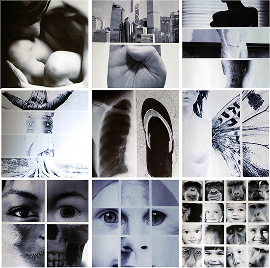
Not only tutorial 1 is about finding relevant and thematic pictures to fit into the predetermined boxes, Amos Chen also has the task to experiment with how a sense of visual order, scale and proportion can be organized to create balance or movement. Each square should have different images drawn from a consistent theme. He works with lines as implied in the images and to create an intriguing visual which logical in structure but yet fluid enough to entice due to the many mashed images that are seemingly "forced" to look coherent.
Tutorial 2: How typographic elements are laid out within a format and orientation can create a thematic consistency for a specific purpose and audience.
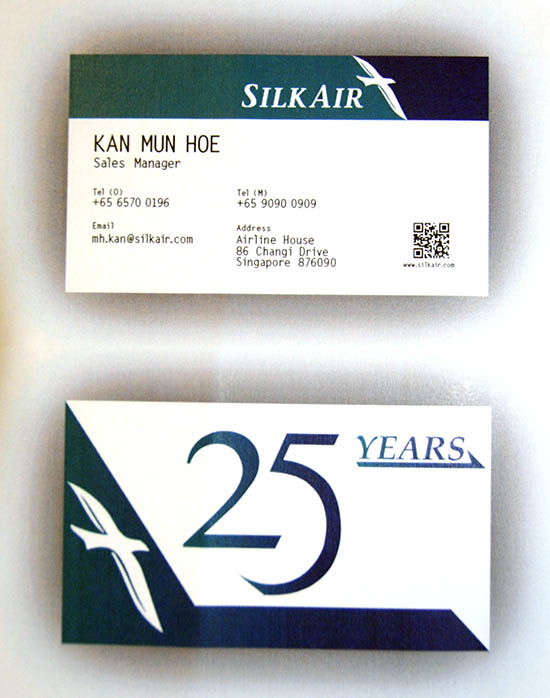
In tutorial 2, students designed a double-sided 2 x 3.5" business card for Silk Air, a Singapore Airline's version of economical airline. They need to create a 25th anniversary logo on the back of the card, as well as the inclusion of their name, designation, contact information (phone number, email and website) on the front of the card and the anniversary logo on the back. Shown here is Kan Mun Hoe's ideas.
Some the questions discussed include:
- Is symmetry or asymmetry used advantageously?
- Is the orientation of the format used advantageously?
- Is there a logical progression (sequence) through the design?
- Does a dominant focal point lead the viewer into the design?
- Is the evidence of foreground, middle ground and background?
- Does the use of space direct the eye toward the positive areas of the design?
- Is contrast used effectively to distinguish the elements in the composition?
- Is the quantity of information in the composition too excessive or minimalistic?
- Does the use of color add value without overpowering or distracting the viewer?
- Do the illustrations or image connote appropriate emotions and meaning?
- Does the typography encourage readability and comprehension?
- If using multiple typefaces, is the combination harmonious and optically matched?
- Does the typography need spacing (kerning and tracking) adjustments?
- Are hyphens, en and em dashes used correctly?
Tutorial 6: Can type be heard?
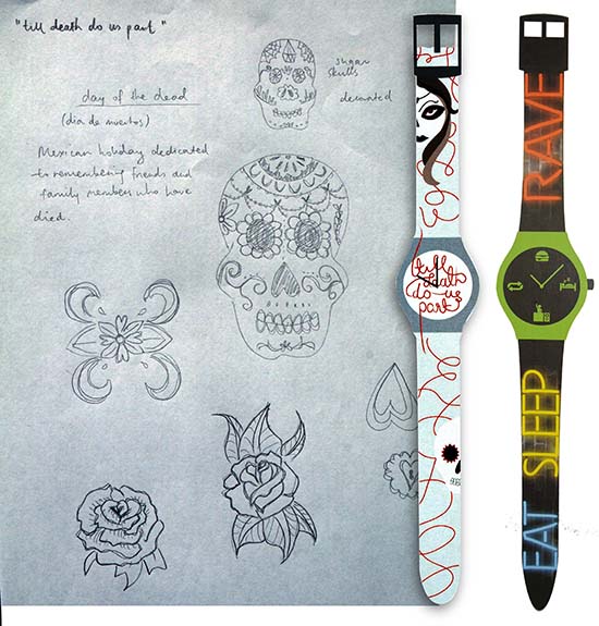
In order to explore if we could hear typography could "SCREAM," Ng Li Ying and Sarah Schwarz used the cover the surface of a watch and its strap as a design surface. The watch design on the left by Ms Ng was influenced by Mexico's holiday dedicated to remembering friends and family members who have died. Needless to say, both designs relied on some graphical treatments to enhance their messages.
Many thanks to Prof. Girish Dalvi, Industrial Design Centre , IIT Bombay - IDC for inspiring the direction of this tutorial.
Tutorial 3: Investigating how a simple and mini Point-Of-Purchase (POP) can enhance a message of a product in a retail store.
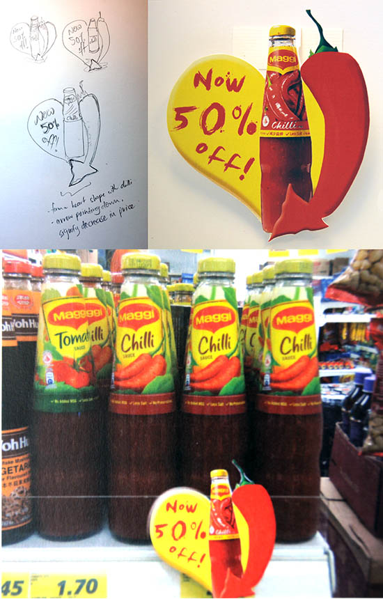
Tutorial 3 is about creating a POP that measures 4" x 6" which carries the main message "50% off" which is displayed before a product on a shelf, in a store of their choice. The students are encouraged to alter the numerals and minimal graphics to enhance the message which include experimenting with different shapes but it should be within the defined size of 4" x 6". POP is generally located at locations where a purchase decision is made. They may design so that the POP is a stand-alone unit or one that dangles or something that can grab our attention. Shown here is Tan Jia Ling's Maggi chilli sauce with a sample of the POP in front of a product on a shelf.
Some referenced sites:
http://ankuradvertisement.blogspot.sg/
http://www.made-in-china.com/showroom/talenttj/product-detaillbHnDvkOHaYR/China-Purchase-of-Point.html
Tutorial 5: A basis for structuring signs and symbols
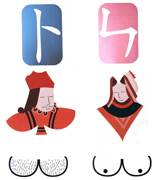
Taking cues that figures in silhouette or contour drawings can be used as symbols or
signs in visual message making, tutorial5 explores how symbols must be easily understood by all individuals, regardless of language or culture. In this tutorial,Zhou Zhuang Yu, Ng Li Ying and Sarah Schwarz created a set of iconographic symbols which visually describes the "toilet" for male and female.
Tutorial 4: Sun Tzu's Calendar
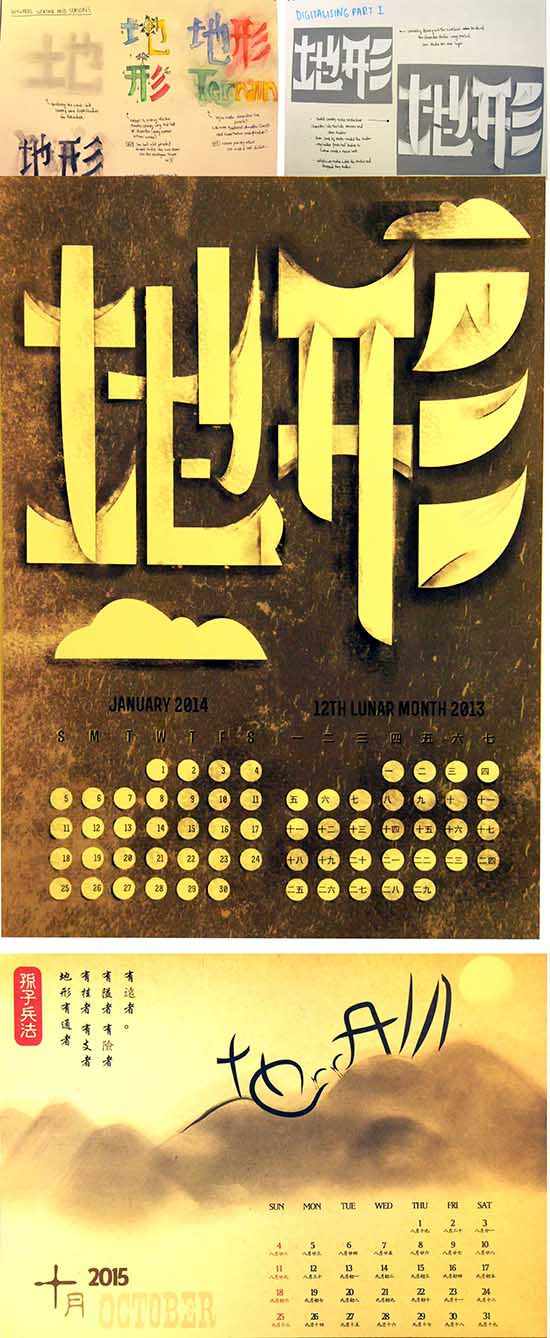
Inspired by Sun Tzu's Art of War, written some 2,500 years ago, this tutorial was designed to test how well students could integrate typographic designs of both Chinese and English characters drawn from any of the famous strategist's 13 chapters. They also added graphical elements to visually suggest/describe what the chapter is about. Their design for a calendar where they get to choose a month of their choice must also include the numerical numbers intended for both the Gregorian and lunar calendars.
These were the following grading criteria:
1. Explored ideas in quantity (sketches)
2. Executed work in accordance to project brief
3. Exhibiting visual unity-a logical integration of form that allows the audience to perceive the form, attribute meaning to it, and derive the intended message guided by your research about the art of war by Sun Tzu
4. Effective integration of Roman letters and Chinese characters
5. Graphical elements to visually suggest/describe what the chosen chapter is about
6. Effective applications of at least two of six support principles: scale, emphasis, rhythm, movement, proximity & repetition
7. Functionality in the overall design of the calendar showing Gregorian and lunar calendars.
8. Quality of craftsmanship through appropriate applications of production methods
9. Submission of a complete project
10. Overall presentation.
Shown here were ideas of Ang Hui Xuan (top) and Collin Wang Yongsheng on the chapter about "Terrain" (地 形). According to Sun Tzu, we may distinguish six kinds of terrain (1)accessible ground; (2) entangling ground; (3) temporizing ground; (4) narrow passes;(5) precipitous heights; (6) positions at a great distance from the enemy.
Tutorial 4: Sun Tzu's Calendar
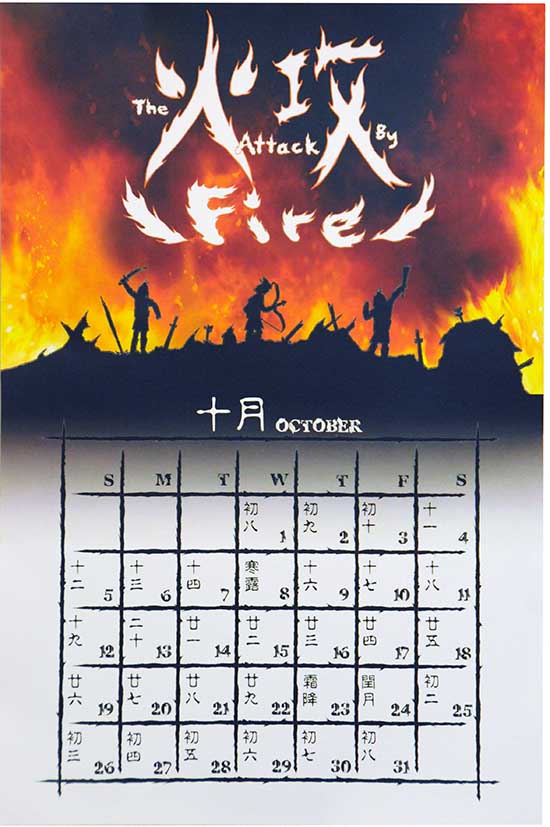
Shown here is Karen Ng Yu Xin's interpretation of Sun Tzu's chapter based on "Attack By Fire" (火 攻).
|
|
YEOH AS EDUCATOR
- MY STUDENTS' CREATIONS
- MY WRITINGS
Select below to view my students' awards as well as their creations from Nanyang Technological University, Texas Tech University, and Southern Arkansas University.
|