| |
S351 Typography
Syllabus for a Typography course (S351) taught at Indiana University Southeast, New Albany, Indiana, USA for the fall semester from Aug - Dec 2015.
The course, S351 Graphic Design 2 (Typography) is about developing the ability to skillfully use typography in graphic design. To do so, fundamental principles relating to typography are explored through a series of progressively complex in-class exercises and assignments, supported by research, readings, ideation, criticism, peer learning, and computer assisted learning (YouTube and other online tutorials such as Lynda.com). This course examines expressive possibilities of typography within the field of graphic design, specifically the application of typography in business communications, promotional and branding purposes. This course will prepare the students for design thinking and methods related to typography as tool for visual problem solving via computer and hands-on methods.
Download: S351 Typography syllabus - fall 2015.pdf

1st exercise: Working Mechanisms of Type: Understanding how to manage a small surface to make a big impression
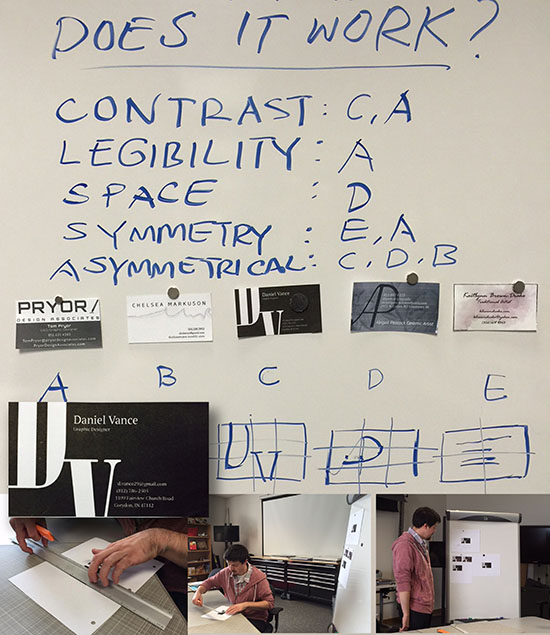
In this 1st exercise called "Working Mechanisms of Type: Understanding how to manage a small surface to make a big impression," which was designed to introduce and explore the fundamentals of conceptual typography, the students are required to create a 3.5" x 2" name card for themselves. The design can be vertical or horizontal but it must contain their name and title, telephone number, an email address, and a street address, a website, Facebook, Instagram or Tweeter accounts (if any). They are required to experiment with Majuscule and Minuscule forms. Color is limited to black only. This exercise also takes into considerations a grid structure, principles of hierarchy and balance, as well as technical issues such as the economies of printing (number of colors used).
Shown here are images of Daniel Vance preparing his business card and presenting it during class in the fall of 2015.
Download: S351 Typography exercise 1.pdf
2nd exercise: Type as Image, Image as Type
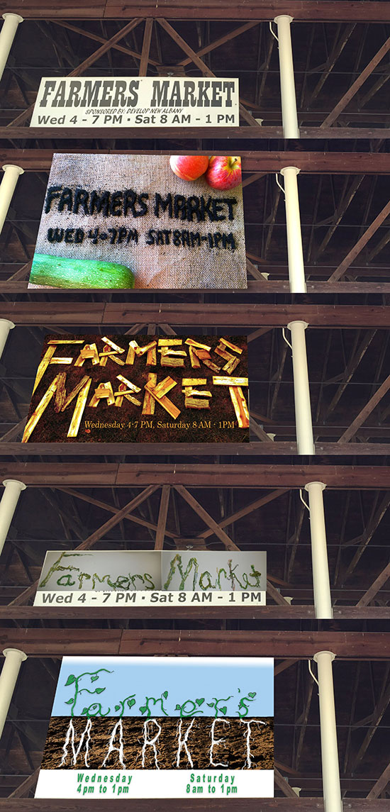
In "Type as Image, Image as Type: Experimenting with other methods of type creations," students are to apply their understanding about the characteristics of display type which will be entirely hand-created, experiment with different ways such as burning, scratching, stitching, tearing and so forth to create their own typeface for New Albany's newly-renovated "Farmer's Market." They are not allowed to use readily available fonts from the computer but you may do so for the operation hours and sponsor information.
Shown here are the original signage of the Farmer's Market followed by ideas by Abigail Peacock, Daniel Vance, Chelsea Markuson, and David Pryor.
Download: S351 Typography exercise 2.pdf
3rd exercise: Flip your type: Applying elements and principles of design to practical fun
The 3rd exercise is primarily a type-driven exercise, this exercise introduces the concept of "persistence of vision" and repetition to create the illusion of motion. Building on previously learned elements and principles of design from foundation, the students are expected to experiment with the principles of contrast to suggest rhythms and movement in a flipbook sized at 3" x 5" (totaling no more than 20 sheets). Using onomatopoeia, they need to carefully think about a word to produce an intended tone in an animated, visual way, stop-motion sort of way.
Download: S351 Typography exercise 3.pdf
4th exercise: Wear Your Type: To expand your knowledge about other forms of type-making techniques
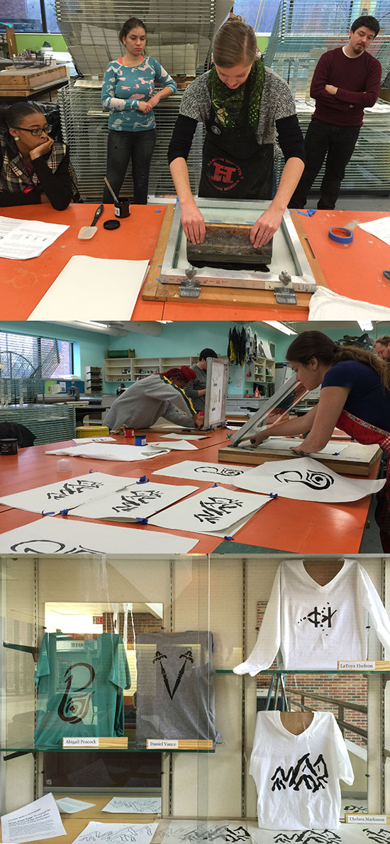
In collaboration with Ast/Prof Susanna Crum from the Printmaking division, the 4th exercise is about using screen printing a process of printmaking which uses a woven mesh to support an ink-blocking stencil. Students are to experiment with designing and cutting an alphabet based on the first initial of their last name. The final design will be placed on a (preferably) white T-shirt. They need to bring their own T-shirt and they need to be aware that the choice of a color other than white can affect the contrast of your design. Your typeface should be of one that exudes your personality. They have to think of it as an expression or a fashion statement that best represents them alphabetically. They will be cutting the stencil and to add some graphical elements, only if it adds to strengthen the personality of their alphabet.
Download: S351 Typography exercise 4.pdf
5th exercise: Kinetic Typography To understand and apply the effect time has on the expression of text via a smartphone app
With so many unsolicited visual bombardments, typography must compete for our attention before it will be read. Although similar to typography, kinetic typography refers to the art and technique of expressing animated text by focusing on the effect time affecting it.
Using Vine (which is Instagram for video), it is essentially a stop motion animation app via your smartphone which gives the students 7 seconds to film a short video clip. Inspired by Scatman John, the late scat singer, John Paul Larkin, who was known for his 1995 hit song "Scatman (Ski Ba Bop Ba Dop Bop), they will animate the word "Ski Ba Bop Ba Dop Bop" using either the computer or handcrafted type to recreate the "flavor" of his music video with Vine. To do so, the students will "emulate" the grid used in the music video. As for colors, stay with black, white and grey scales and instead of images, they will use the word "Ski Ba Bop Ba Dop Bop" only and to keep the background simple so that their fonts can be better contrasted for a maximized visual effect. Vine automatically records sound so they may wish to include clips from the video or they may use their own voice. This is a form of exploring filmmaking. To conclude, they will add a hashtag #scatman followed by a description "IUSFineArts" and post their video when they are done.
Download: S351 Typography exercise 5.pdf
6th exercise: Outsider Typography: To experiment and explore type for type's sake
An outsider art describes artwork created outside the boundaries of those who have not been trained or conditioned in the way art is supposed to be created. Think of animals, children, or the insane who pick up a brush and wowed us with something out of the art world. This is one assignment that is experimental as it is raw.
There is no specific clear direction where this in-class exercise will take us.
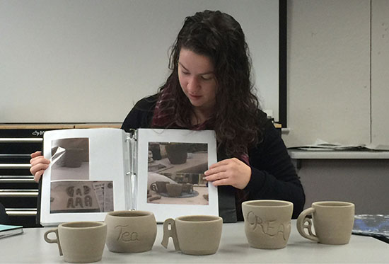
We will draw from a pool of chosen words in which you will then express them as a raw typographic expression. It can be a sculpture, a performance art, a short film, etc. For this exercise, Abigail Peacock, a ceramics major experimented with incorporating typography into the 3-dimensional aspect of her mugs.
Download: S351 Typography exercise 6.pdf
|
|
YEOH AS EDUCATOR
- MY STUDENTS' CREATIONS
- MY WRITINGS
Select below to view my students' awards as well as their creations from Nanyang Technological University, Texas Tech University, and Southern Arkansas University.
|