| |
Typography Day 2013 poster submission winner
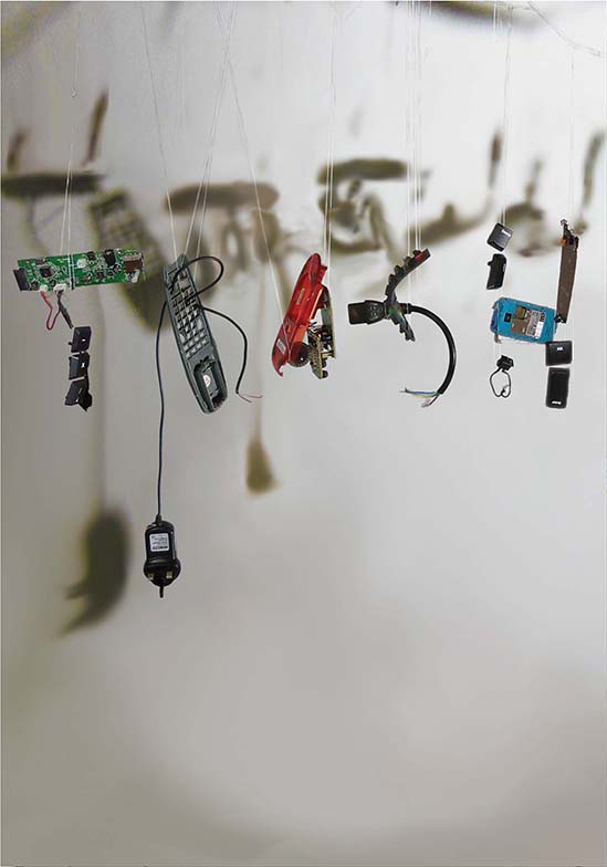
Anna Kjaedegaard, an exchange student from Denmark poses the question if there is life after death but in the world of sustainability, the answer is a "yes" as her poster states the possibility to give products of trash a reincarnation as treasures. Trash is presented using English Language to symbolize the western materialistic world. The short lifetime of especially electronic products in the wealthy Western World, leads to dumped goods being shipped to countries like India. The poorer population of India regards materials as 'treasures.' Workers separate the goods in different materials - Doing the dirty work of the West often results in a dangerous and pollutant burden on the receiving country. The Tamil word for treasure 'புதையல்' is shown as shadows. To reach a sustainable world, there must be a better understanding of how products should be designed. So "trash" could be a Word belonging to the past. The items on the poster are E-waste actually found in the streets of Singapore.
Anna's poster (shown here with a proof of online submission on the right) was the selected amongst 372 entries by the Typography Day 2014 jury members for its high quality of representation. All the winning entries are published and displayed in an exhibition during the event from Feb 28 - March 2, 2014 at the Symbiosis Institute of Design, Pune, India. As a winner, she is entitled to free participation (workshop/seminar expenses and food) during the Typography Seminar and Workshop.

Typography Day 2013 poster submission
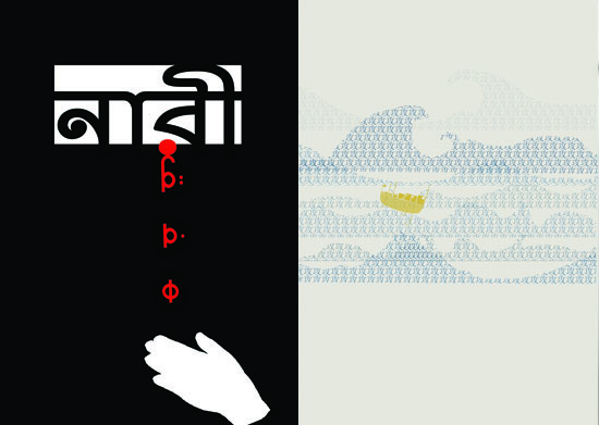
Left: Martina Moy Yanming's poster illustrates the antonyms "Man" and "Woman," in Arabic and Bengali respectively. Every day, the papers bring heart-breaking reports of men inflicting abuse and cruelty on women. Arabic and Bengali represent the proliferation of such sexism in the Middle East and Calcutta. Pictorially, the poster shows a woman trapped behind a hijab or in a room/ prison cell. Only her eyes can be seen and she is crying. Her tears are red, suggesting bloodshed and pain. If seen as a woman in a hijab, her hand is resting upon her chest in vain. She is unable to save herself. If interpreted as a trapped woman, the hand is that of a sympathetic person, collecting her tears but unable to save her. The Bengali word for "Woman" form the woman's eyes while the Arabic word for "Man" form her tears, as it is the Man who makes the Woman weep.
Right: Foo Pei Ying's poster was inspired by the standoff between China and Philippines over the ownership of the islands within the South China Sea.
Typography Day 2013 poster submission
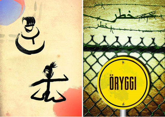
Left: According to Remington Chia, the two words portrayed in this poster submission for Typography Day 2013 are the Korean character 문 (文; culture) and the Japanese character む (武; military). Essentially, this poster compares two iconic figures in Confucianist Korea and feudal Japan. The character 문 is shaped to represent a seonbi (virtuous scholar), a scholar with integrity and virtue who opposed corrupt court officials. On the other hand, the character む depicts an honorable warrior who embodies the bushido spirit (the way of the warrior). Undeniably, the historical conflicts between Korea and Japan cannot be ignored, seeing how these differing ideologies influenced each country's actions. However, the aim of this poster is not to pass judgement on who is right and who is wrong. Instead, this poster brings together two seemingly conflicting ways of life and attempts to reconcile the two and let them coexist peacefully with each other.
Right: Cheryl Teng Sze Hui chooses opposite words of "Safety" and "Danger" after he research showed that the most dangerous and safest country in the world are Somalia and Iceland respectively. For her poster, she uses their national languages and she creates a wire fence that represents a safety zone being cordoned off, with a yellow sign reading: "ORYGGI", which meant "safety" in Icelandic. Above the wire fence are barbed wires used as further deterrence to prevent others outside the boundary from trespassing. The Arabic word means "danger" as her intention is to show that a tool meant for safety can be inherently dangerous, and vice versa.
CREATE brochure
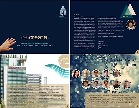
A total of 31 students from Graphic Communication contributed their ideas for a real client from the School of Material Science and Engineering, Nanyang Technological University in Singapore. Professor Robert Marks was happy with the brochure idea and felt that some of them "had artistry." The water management thrust he heads is a composite of research areas which includes monitoring water toxicity and remediation by using advanced tools including nanomaterials. In addition to exposing to their readers the collaborations both in Singapore and overseas, publications, awards, and scholarships, the brochure also seeks to attract potential collaborators. Shown here is an example of a horizontally-sized A4 brochure by Grace Lee Yian Ni.
Tutorial 1: How compositional elements can be positioned on a 2 - dimensional plane by dividing a square format into the following formats
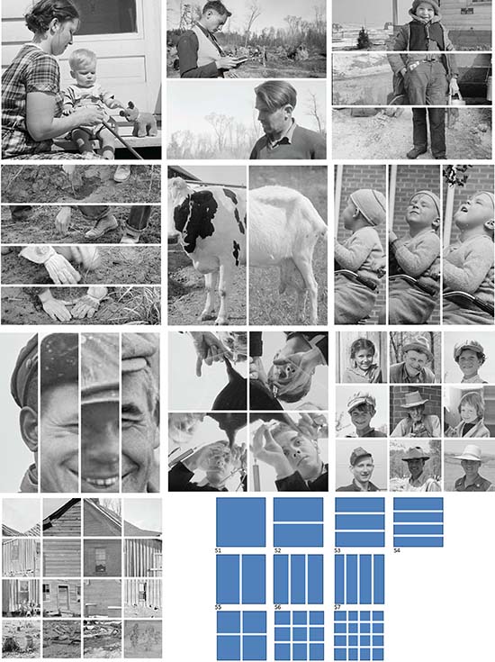
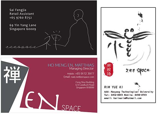
The first tutorial is about understanding how images can be re-juxtaposed in 10 distinctive squares with pre-determined grid structures to investigate visual elements of form. Students experiment with how a sense of visual order, scale and proportion can be organized to create balance or movement. Utilizing the library of congress website (loc.gov) or an alternative database with high resolution images, each square should have different images drawn from a consistent theme. They work with lines as implied in the images and because lines can create the illusion of depth, tone and visual texture on surfaces, the assignment is about understanding how images in each square can be "reshaped" when placed in a structural grid of squared formats. Factors that influence the design of the visual message on a format include the intended reading order or hierarchy. By arranging the compositional elements within a grid system, the visual message can be presented in a logical yet intriguing manner. Shown here are Sai Feng Jia's grids.
Tutorial 2: How typographic and pictographic elements are laid out within a grid structure, format and orientation to create an eye movement aided by a design theme and motif for a specific purpose and audience
Although the purpose for the 2nd tutorial is really about understanding how to create layout using Adobe InDesign to prepare to prepare the students for their first assignment to create a brochure, the tutorial also exposes how typographic and pictographic elements are laid out within a grid structure, format and orientation to create eye movement aided by a design theme and motif for a specific purpose and audience.
Tutorial 3: How structural forms via packaging can enhance a message as the chosen theme
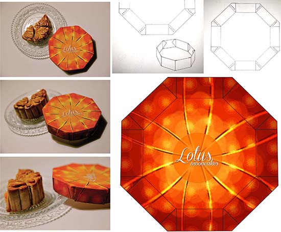
Exploring 3D in the 3rd tutorial, the students investigated how structural forms via packaging can enhance a message as the chosen theme is the mid-autumn festival or lantern festival. This tutorial is also an opportunity to expose students to using Adobe Illustrator. With a template for the packaging provided, students created abstract and decorative textures by repetition of patterns to enhance the look of a surface for moon cake packaging. The name of the bakery is "Lotus moon cakes." Due to its octagonal shape, the diameter is accommodated by the width of an A4 paper. Students have the option to create a smaller one so that it could form the base lid for this fictitious packaging. The deliverables are one flat color A4 print of the packaging disassembled and a mock-up of the final packaging (a dimensional model). In the final presentation in their workbook, the students may wish to photograph the mock-up and display it on a printed page. Shown here is Charisa Kow Xin Yi's moon cake packaging.
Template source: Roth, L & Wybenga, G. L. (2000) The Packaging Designer's Book of Patterns (2nd edition). NY: John Wiley & Sons., p. 91
Tutorial 4: Meaning can be reinforced in visual images or words by using size to contrast/to create emphasis
Human�s search for relationships within the universe, the natural world, and the physical forms have led to numerous studies of visual and physical attributes of form in objects. In tutorial 4, students explore how size, scale, dimension, proportion and tactile texture are related to the form generation process. These attributes are both visual and physical because they can be perceived through both visual and tactile means. As we intend to create emphasis through scaling, students experimented with reinforcing meaning in visual images and words by using size as contrast. Using the statement, "size does matter" and a graphical element which can be an image they create or something the find from the internet, they created a compositional layout in A4 (horizontally or vertically) which uses size as a contrasting element to communicate your idea. The creations don�t have to take on the format of an advertisement as it could be a visual pun or something else. Tan Guan Jie used type in different sizes placed at different angles to show how repetitiveness can contribute to the statement "size does matter."
Tutorial 5: A basis for structuring signs and symbols
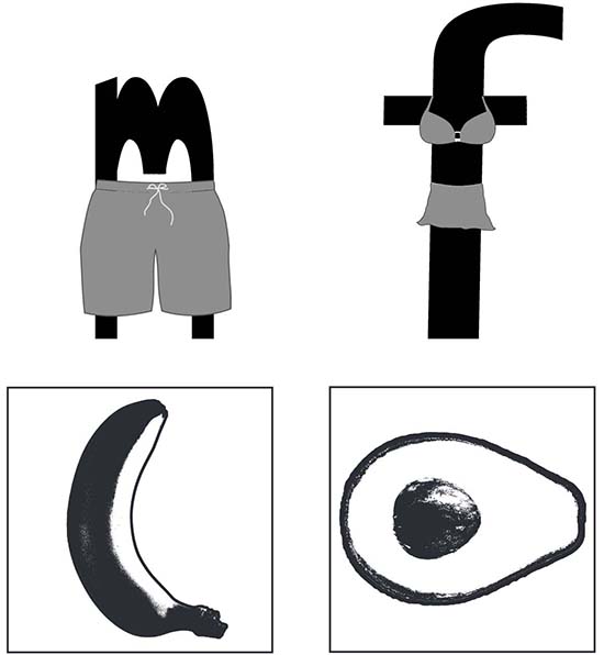
Symbols must be easily understood by all individuals, regardless of language or culture. Taking cues that figures in silhouette or contour drawings can be used as symbols or signs in visual message making, students are tasked in tutorial 5 to create two iconographic symbols which visually describe "toilet" for male and female. While they may explore by using simple monochromatic tones only, an effective symbol must first work in b/w before its color treatments are applied. They are reminded to allow adequate amount of white space that aids the support of balancing the two symbols within a given space. Top: Wong Yun Lam's interpretation followed by Tan Jing Ting's at the bottom.
Tutorial 6: Can type be heard?
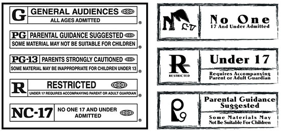
Since there is a kinship between expressiveness in typography and sound through rhythm, volume, montage, pauses, pace, style, accent, clarity and tone, the students get to explore how to "SCREAM" typographically by investigating the MPAA (Motion Picture Association of America) [shown here on the left]rating system in tutorial 6. Currently, there are 5 ratings:G, PG, PG-13, R or NC-17 for parents to indicate the degree of caution to exercise in weighing whether a movie is suitable for their children. Omitting the logo of MPAA, students redesigned three out of the five ratings in b/w (in Illustrator). They need to keep the design to its original form but play with the degree of tone to express how "loud" the logo should look typographically. Koh Yong Sheng had a playful approach to the otherwise serious tones of these warning labels that people usually don't pay much attention to.
Many thanks to Prof. Girish Dalvi, Industrial Design Centre, IIT Bombay - IDC for inspiring the direction of this tutorial.
Tutorial 7: What's in store?
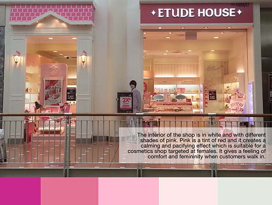
In tutorial 7, students are tasked to explore how color, as part of the visual grammar is used to entice us in this self-service age. Through a brick-and-mortar retailer, they studied the color palette used to pry into the application of color in commerce. Is the color complementary or analogous? Triad or tetrad? Or simply neutral? How are colors used to transform the space? It's simply not just the way they look, but also the way we feel about the space. Is it inviting, soothing, energizing or pacifying, contrasting, harmonious? For reference, they logged on to http:// www.colourlovers.com/home/trends/interior-looks for ideas
Tutorial 8: A minimalist in a maximalist market? Is less more?
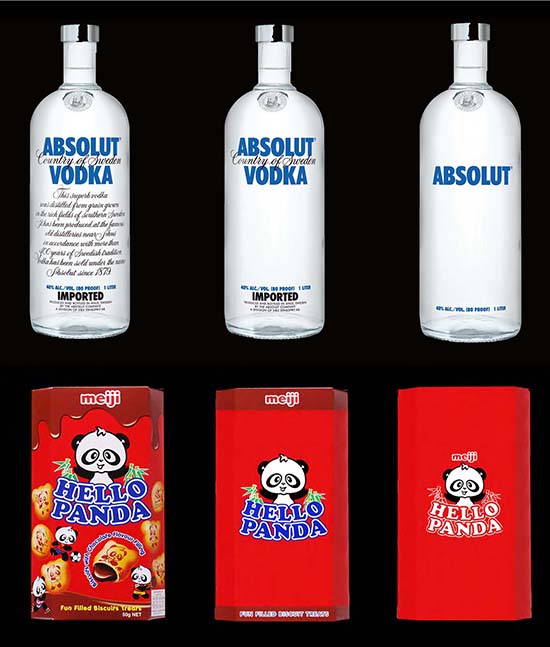
Is less more? In their final 8th tutorial, students took on the minimalist persona by taking a shot at minimizing some product packaging of their choice. If minimizing is about organizing complexity into the absence of clutter, they get to find out how many layers to "peel" away until we reach the essence of product that you will find at the supermarket. For reference, they logged on to http://www.a2591.com/2010/12/minimalist-effect-in-maximalist-market.html. First, they need to find a foreign or local product from a local supermarket shelf before exploring 2 options to simplify the original packaging into a simple variation and a simpler variation. They may use Photoshop or illustrator or both to create explore this simple tutorial. Simple as it may appear, the real task is to analytically study how to simplify while keeping the essence of a product alive even in its simplest form. Is it the color, the font, the placement of the type? If a brand relies on color, what other emphatic elements can be relied on for reaching that purist state? The deliverables are 3 images presented side by side horizontally showing the original on the far left, a simple variation and a simpler variation. Shown here at Quek Shi Min and Matthias Ho's minimalistic approaches to the packaging.
|
|
YEOH AS EDUCATOR
- MY STUDENTS' CREATIONS
- MY WRITINGS
Select below to view my students' awards as well as their creations from Nanyang Technological University, Texas Tech University, and Southern Arkansas University.
|