| |
Research Project: Shockvertising in public service advertisements
As a group project in the form of a mini research, group members researched literature backed by data to present their findings in PowerPoint presentation as well as submission of a research paper at the end of the semester. As a group project, the groups were encouraged to pro-actively meet during class or outside of class.
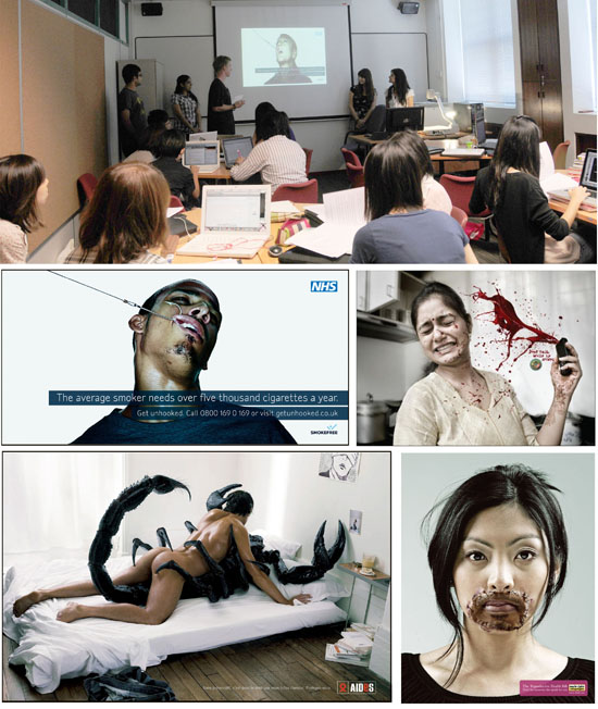
Aneesha subramaniam, Akhil Chimnani, Aradhna Kaur, Julia Cicale and Kim Lindell presented their group research topic "Shockvertising in public service advertisements. Pioneered by the Italian clothes retailer Benetton in the late 1980s, 'shockvertising' is a type of advertising that is used in the advertising business to sell a product or communicate a public message. It is controversial, and is increasingly being employed in awareness campaigns to capture attention through the use of scare tactics.
The purpose of their paper was to examine shockvertising in public service advertisements - whether it is an effective strategy due to the use of outrageous visuals and grotesque images, and whether it has a greater impact than traditional advertising in conveying a particular message. By analyzing four sets of public service 'shockvertisements' targeted at the general public to raise awareness about common issues, namely birth control, AIDS awareness, anti smoking and safe driving, they attempted to answer these
questions. They included an analysis of the elements and principles of design that are pertinent in shockvertisements and conclude with the effectiveness of shovertisements based on their findings.
They analyzed that these campaigns share many characteristics that contribute to their effectiveness. All are obviously visually driven, forcing the viewer to focus entirely on the disturbing images. The main reason for the effectiveness was the violation of a person's expectations and comfort zone. In terms of design elements, all the case studies most obviously used white or light and neutral background so as to provide a stark contrast between the main focal point and the background. There are no elements distracting from the main message. They noted that throughout the four campaigns, very little color was used, with the exception to the "Road Safety in India" ads, which featured bright red blood exploding out of a phone in each advertisement. This reinforces that if a bold color is to be used, it must convey a strong connotative message. This is also true to some extend in the AIDS awareness in France" campaign, which utilized a deep black on the creature when contrasted to the white space which is predominant in the rest of the advertisement.
They noticed that the last design element each campaign used was one main shocking element that was supplemented by a small but compelling tagline which is necessary because without it, the ads would simply lack reasoning or call to action. The shock garners the attention, while the message behind the image invokes a response in the viewer.
Source:
http://theinspirationroom.com/daily/2007/get-unhooked-2/
http://theinspirationroom.com/daily/print/2007/12/aids_scorpion.jpg
http://trendsupdates.com/make-your-own-decision-the-birth-control-issue/
http://www.coloribus.com/adsarchive/prints/drive-safely-with-mobile-phones-talk-them-dead-house-wife-13651405/

A Study of Logos and their Trends in the Food & Beverage Industry
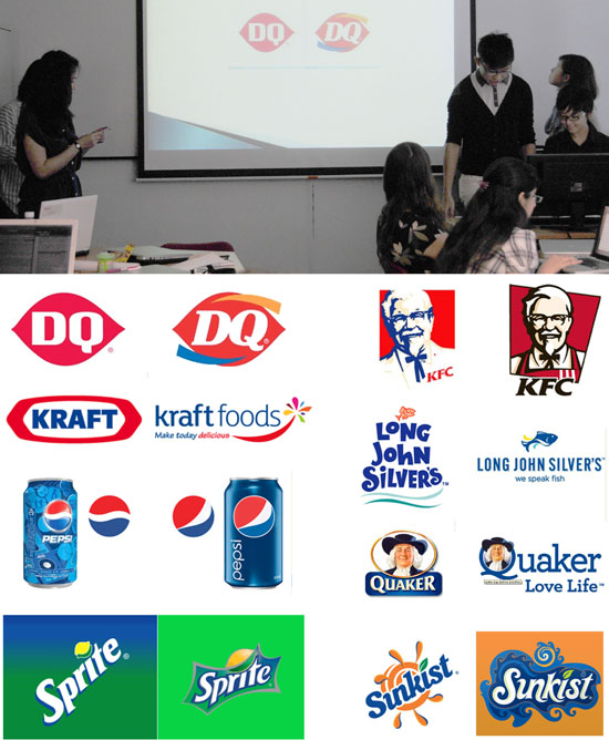
Clement Cher Jia Hui, Glenda Tang Ying Ying, Siau Ming En, Hong Shuqi and Chua Yini presented their study on how logos used in Food and Beverage (F&B) industry have been redesigned. Logos are visual representations of a company's brand and are important visual markers for conveying brand value. The F&B industry makes use of logos to sell their brand to consumers. In the past decade, we noticed many companies have invested in the redesigning of their logos to include novelty elements such as anthropomorphism, taglines and dynamism. A study of eight F&B logos is conducted to determine the types of changes made and the impact the change has on consumers. The paper identifies and analyses the trends from various redesigned logos. It concludes with exploring the reasons for the trends identified. Limitations as well as further research are also highlighted.
A logo is defined as a graphic representation or image that triggers memory associations of the target brand (Walsh, Winterich, & Mittal, 2010). Therefore, a logo encompasses the value and essence of a brand. Logos serves as strong visual identity and can be applied to many important aspects of branding such as product, package or collaterals. They investigated beverage industry for companies that re-branded over the years and had made changes to its logo to support its re-branding purposes. In their research paper, F&B companies came from different spectrum of the industry with logos that are either from individual food brands (E.g. Quaker Oats) or drink brands (E.g. Sprite), or companies that falls under the F&B category standards (E.g. KFC and Long John Silver). This wide spectrum of study was selected to allow for clearer study of the logo-changing trend in the F&B industry, and to determine how these changes allow for greater expansion.
The trends for redesigned logos from the past decade have made new logos more modern and relevant to the current consumers, through anthropomorphism (adding smiles to the logo), adding taglines or dynamism (colors and movement).
The trends for redesigned logos from the past decade have made new logos more modern and relevant to the current consumers, through anthropomorphism (adding smiles to the logo), adding taglines or dynamism (colors and movement). Overall, anthropomorphism is used to establish human connection with consumers, making it more relate-able. It also enhances trust relations and perceptions of enjoyment. Some brands may also add an additional tagline to their existing logo, to reposition itself and to also communicate the brand essence to consumers. It builds a stronger brand image, and would allow consumers to better understand the brand values and increase brand recall. Redesigned new logos may also rounder in both their illustration and typeface to present a more friendly and harmonious outlook. More colors are also added, with curved lines to add movement and dynamism to the new logos. All together, these elements add novelty to a logo that has been used for several years, to refresh the brand image and yet maintain consistency with the previous logo.
Source:
Berlyne, D. (1976). 'Similarity and preference judgments of Indian and Canadian subjects exposed to western paintings'. International Journal of Psychology , 11 (1), 43 - 55.
Brown, D. E. (1991). Human Universals. New York: McGraw-Hill.
Freeman, K. (2005). Creating strategic taglines. Strategic Direction , 21 (10), 3-4.
Gilmore, G. W. (1919). Animism. Boston: Marshall Jones.
Guthrie, S. (1993). Faces in the Clouds: A New Theory of Religion. New York: Oxford.
Henderson, P. W., Cote, J. A., Leong, S. M., & Schmitt, B. (2002). 'Building strong brands in Asia: selecting the visual components of image to maximize brand strength'. International Journal of Research in Marketing , 20 (4), 297 - 313.
Horn, R. E. (1998). Visual Language: Global communication for the 21st century. Bainbridge Island: MacroVU, Inc.
Walsh, M. F., Winterich, K. P., & Mittal, V. (2010). "Do logo redesigns help or hurt your brand? The role of brand commitment". Journal of Product & Brand Management , 19 (2), 76 - 84.
http://www.underconsideration.com
All logos and trademarks are registered trademarks of their respective companies./
The modification of Chinese Characters in Japanese Kanji
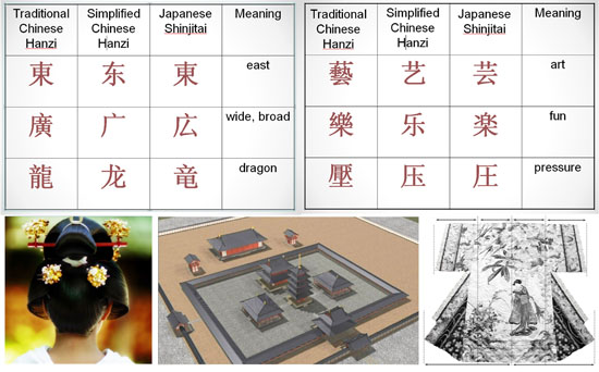
Chen Jing, Lee Zhi Hui, Ng Jia Min, and Tan Jinhe investigated how the similarities between the Chinese Han characters adopted in Japanese kanji have resulted in variations over two thousand years in which traditional and simplified forms of Chinese characters were both adopted (Lu, 2002). The Japanese kanji is largely adopted from traditional Chinese characters and has been made unique to the Japanese through modifications of the original Chinese characters. For example, 氣 (Chinese) is written as 気 (Japanese) and 廣 (Chinese) as 広 (Japanese). Although their general form remains the same, the Japanese have distinguished themselves from their Chinese counterparts through such modifications.
They studied the similarities between the two cultures in which balance, symmetry and harmony play a part in the evolution of the Japanese and Chinese writing systems, where they share the common trait of writing characters in a square grid with radicals. Their primary research was done through interviewing linguistic experts of both languages and supported by secondary research of reviewing scholarly journals, comparing of the Chinese hanzi and Japanese kanji, and identification of patterns of modification.
According to Japanese language teacher Akiko Amitani (B.A. in Japanese History), while the younger generation Japanese in their 20's and 30's are open to foreign culture due to travel and business exchanges, the generation before them is less receptive. But despite the influence of foreign culture in Japan, a child's upbringing still emphasizes balance and symmetry, the two cultural beliefs the Japanese have adhered to since ancient times (Amitani, personal communication, April 8, 2011). Symmetry is evident in the designs of old Japanese architecture such as the Buddhist temples and even small details in one's appearance such as the proportion of one's hair parting, while balance can be seen from their belief in dialectics, such as yin and yang, sun and moon, and day and night (Kitayama & Markus, 1999). From the in-depth interviews, it can be inferred that the Japanese perception of beauty and aesthetics would explain their choice of traditional Chinese characters over of the simplified version as they value people's perception of them through their outward presentation such as one's handwriting (Hendry, 1995).
Another factor that contributed to the evolution of Chinese characters in the Japanese writing system is the simplification of characters. According to Amitani, when the Chinese started using simplified characters, the Japanese attempted to adopt them. However, as mentioned previously, they were uncomfortable with the asymmetrical shapes of certain characters like 气 and 广, hence they added elements for aesthetic balance, which led to the creations of 気 and 広 respectively.
When it comes to simplification, we also found from our interviews that the Japanese not only simplified individual characters but also idioms widely used in China. One example would be the Chinese idiom 指鹿为马, which literally means "pointing at a deer and calling it a horse" and has the connotation of "stupid". Based on this meaning, the Japanese shortened the idiom to 馬鹿 (pronounced at baka in Japanese) to mean "idiot". These two forms of simplification portrays the minimalist nature of the Japanese and how they do not adopt the Chinese simplification completely. Instead, their cultural beliefs play a large role in deciding how they simplify their characters and made them unique to Japan.
The students predicted there might be less use of kanji in the future. The technological advancement in Japan in recent years may have made it difficult for kanji to survive and the ease and convenience of typing on the computer may replace writing by hand. Consequently, younger generations may be less accustomed to writing kanji by hand and gradually lose touch with it. According to Tsujita, the lifestyle changes resulting from technological advancement may lead to young people "being able to read but cannot produce", as is evident in the increased use of Hiragana in place of easy Kanji on television subtitles. For the Japanese to be "well-informed and fully articulate in both domestic and foreign affairs, they must be given a more simple medium of reading and writing than the Kanji" (Tsujita, personal communication, April 19, 2011).
Due to the learning difficulties involved, the government may further simplify the current set of Kanji characters to accommodate a trend towards simpler symbols such as the Hiragana and Katakana, following the footsteps of the Korean language as they gradually remove the Hanja (Chinese characters) and only write with the unique Hangul (Korean characters) now.
Sources:
Hendry, J. (1995). Wrapping culture: Politeness, presentation and power in Japan and other societies. United Kingdom: Oxford University Press.
Kitayama, S. & Markus, H.R. (1999). Yin and yang of the Japanese self. The Coherence of Personality: Social-cognitive Bases of Consistency, Variability, and Organization, 242-250.
Lu, X.G. (2002). The spread of Chinese characters into Japan and the origin and
formation of Japanese characters. Journal of East China Normal University (Philosophy and Social Sciences), 34, 88-97.
Corporate Identity
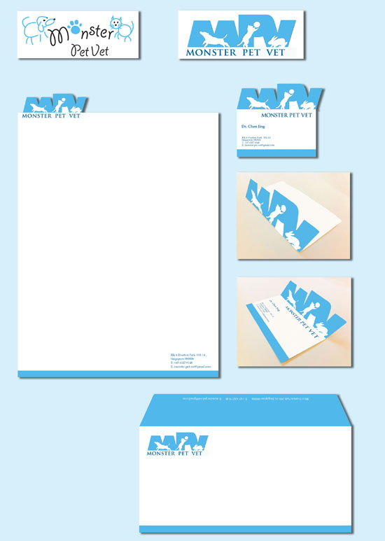
The basis of many logo designs are graphically based on geometrical shapes made of lines, circles, squares and organic shapes. In this corporate identity assignment, students must select a logo that belongs to a local company and the logo is deemed "ugly" which needs a serious overhaul. They then apply the newly revised logo on the following stationery items: business card, letterhead and envelope. Chen Jing contrasted reversed silhouettes of three playful animals on MPV, the three initials of Monster Pet Vet. Due to the stockiness of the font, she staggered the fonts to create a rhythmic flow and the clever twist to the solution is the die-cut on the letterhead and the business card which gave the logo a strong focal point.
Corporate Identity
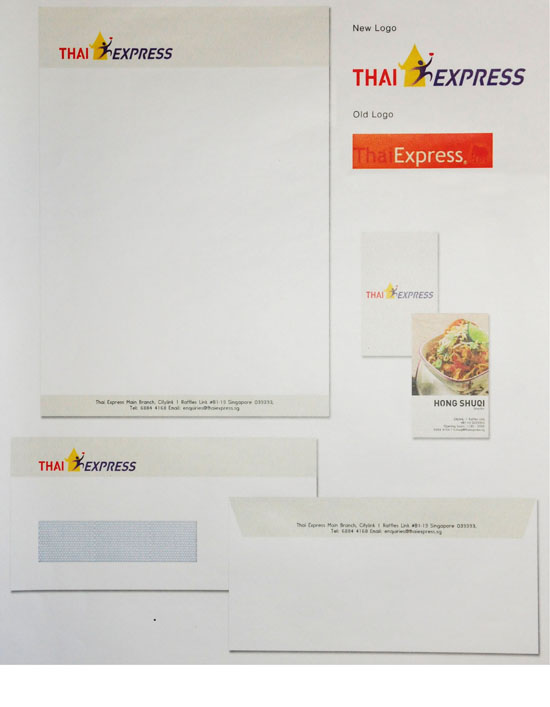
The basis of many logo designs are graphically based on geometrical shapes made of lines, circles, squares and organic shapes. In this corporate identity assignment, students must select a logo that belongs to a local company and the logo is deemed "ugly" which needs a serious overhaul. They then apply the newly revised logo on the following stationery items: business card, letterhead and envelope. Hong Shuqi chose Thai Express and her solution called for an abstract silhouette of a waiter rushing off to deliver food, hence the idea of "express". Contrasting the waiter was another silhouette of an architecture that mimics the architectural design of Thailand.
Education poster
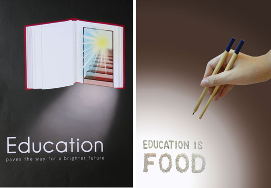
For their 3rd and final assignment, students created firstly, a digital file and a physical poster. The former was meant for a poster competition submission which is done online and the latter was for a class submission for their final grade. Every child in the world is guaranteed a primary education (at least) under the Universal Declaration of Human Rights.
Shown here are works of Hong Shuqi (left) and Chen Jing (right).
Education poster
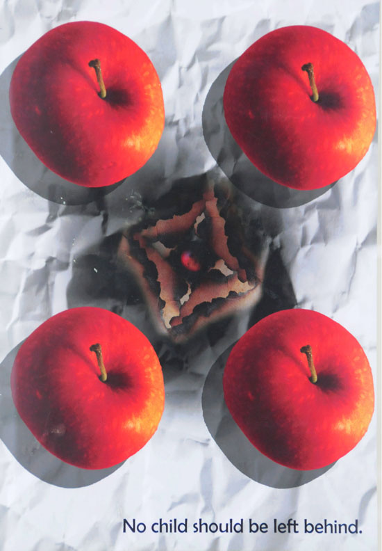
Shown here is the work of Jacqueline Wong Syn Li.
Education poster
Shown here is the work of Goh Jien.
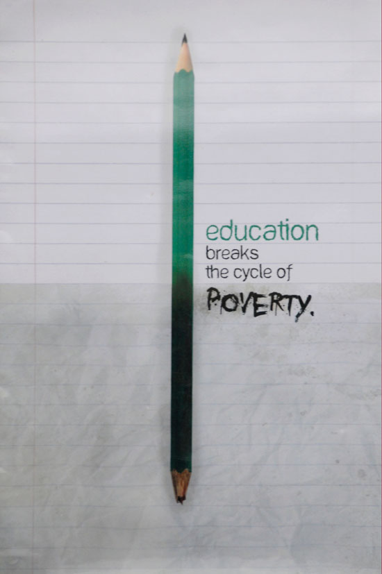
Education poster
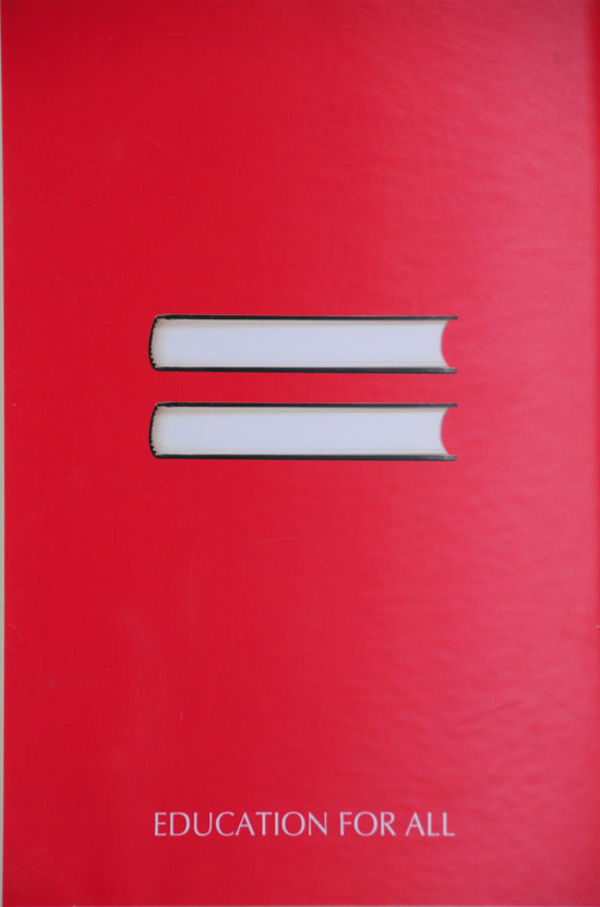
Shown here is the work of Glenda Tang Ying Ying.
|
|
YEOH AS EDUCATOR
- MY STUDENTS' CREATIONS
- MY WRITINGS
Select below to view my students' awards as well as their creations from Nanyang Technological University, Texas Tech University, and Southern Arkansas University.
|